

Hargreaves Lansdown
Designing trust into Financial wellbeing and bringing consistency to a fragmented product.

Project Duties
UI
Hargreaves Lansdown’s Augmented Advice dashboard was designed to help users track and improve their financial wellbeing.
However, the name itself was misleading. Due to Financial Conduct Authority regulations, the product couldn’t offer “advice” – only guidance. This confusion reflected a deeper issue: the product wasn’t being built with user needs, clarity, or consistency at its core.
Our brief was to join this project which had already moved from design to development and bring user-centred thinking, visual coherence, and technical alignment to a product that had been designed more around stakeholder needs than user ones.
Reconnecting to the Design System
One of my first tasks was reviewing the existing UI work. It was immediately clear that the design didn’t align with HL’s brand or design system. The dashboard looked like a completely different product - visually inconsistent, structurally disconnected, and lacking a unified language.

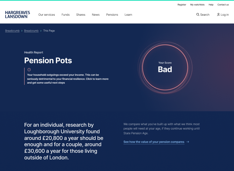
Existing Hargreaves lansdown site
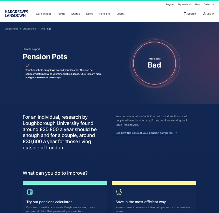
Dashboard when we joined the project
We started by rebuilding trust – across teams, and with users. Working closely with HL’s internal Design System team, we began integrating existing components into the product. This brought immediate visual consistency, but more importantly, it allowed us to design with scalability and accessibility in mind.
Where we found gaps in the Design System, we used user testing to gather feedback. We then shared insights with the Design System team to help evolve components based on real-world use – not just theoretical patterns.
This collaboration turned our design work into a two-way conversation: respecting the system while helping improve it.
Designing for clarity and confidence
A key part of the product was a financial health check powered by data models from Oxford Economics. Users were asked for very specific financial inputs—like the amount of sick pay they received monthly. In testing, it became clear that most users didn’t know this, or how to find out.
We redesigned the interface around these questions, adding explanatory content and guiding language, all delivered using design system components. These were small changes—labels, copy tweaks, tooltips—but they made the product far more approachable and trustworthy.
Outcome
Eventually, Hargreaves Lansdown decided to rebuild the product (now renamed Financial Future Dashboard) from the ground up – this time with user needs at the centre. The trust we’d built across teams, and our alignment with the design system, gave the product a clearer direction and a stronger foundation.
The work continues, but the shift is clear: we’re no longer designing in silos—we’re designing as part of a system.
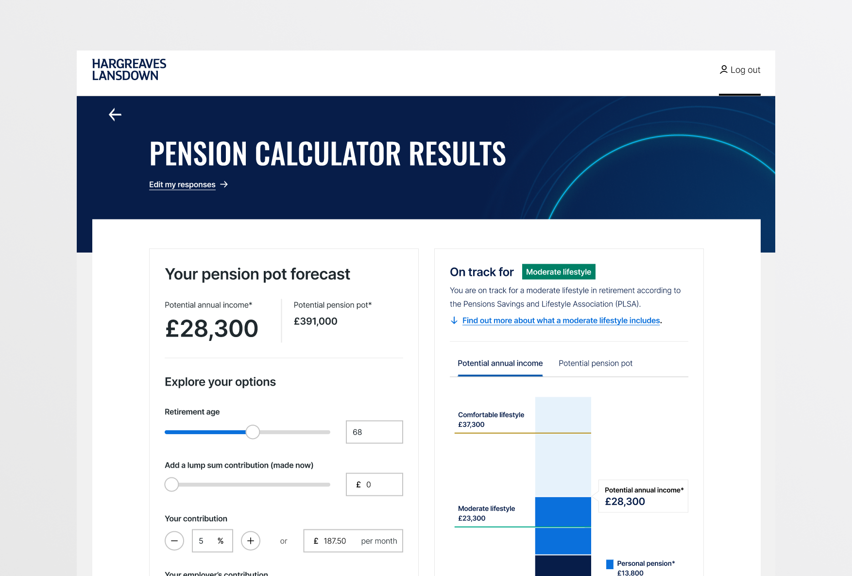
Dashboard when we joined the project
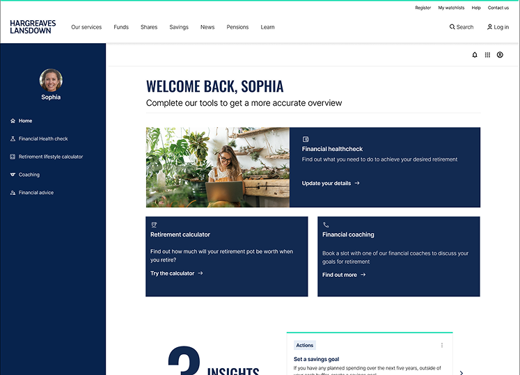
Updated dashboard designs