SBank
Design system followed by white label product design for this financial technology provider.

Project Duties
UX
UI
Sopra Banking have a range of products built across various different technology platforms. Created by different teams, often large teams with multiple designers and stakeholders they’ve created a lot of inconsistency and products of varying standards. They asked us to create a design system to help them create consistent user experiences.
Making the case
A unified design system can be important for building better and faster. Better because a cohesive experience is more easily understood and faster because it gives us a common language to work with.
To sell the idea to stakeholders, we conducted an audit of some of their flagship products. This was effectively a large Miro board showing all the different and inconsistent variations of various components that existed across their products.
It sounds simple but it was a really important process for getting key stakeholders often from their own narrow product worlds to agree on the problem and agree on the right solution.
Laying the foundations
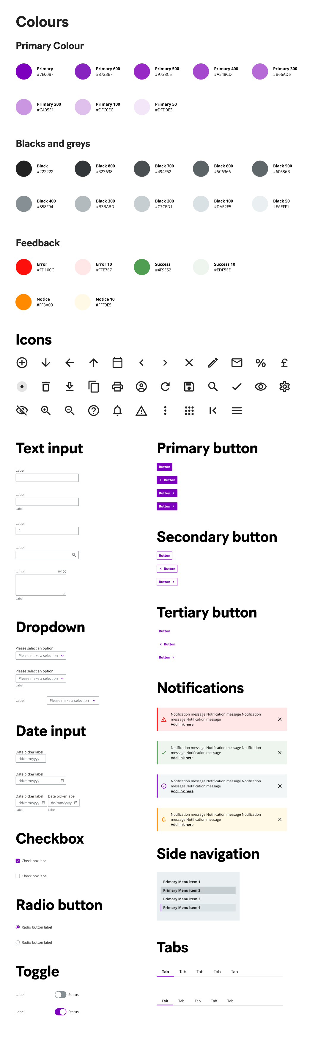
We created styles and patterns in Figma from foundational elements like colour, typography, iconography, layout and spacing to more specific components like buttons and form fields to produce a library of assets a product designer can use when designing a new product .
Anyone wishing to use the patterns and components from the design system can switch the library on and immediately have access to the latest assets in their project file.
Each component has been carefully built to be responsive, editable and to contain all the variants a product designer might need.
Adoption
We were pleased with the design system from the perspective of a product designer but the bigger challenge was getting people from different parts of the organisation (business analysts, marketing and development teams) to start using it.
We created a dedicated website to act as the presentation layer of the design system. We were able to create a semi-dynamic link so that changes made to the Figma files could easily be updated in the website.
The website holds component specifications and general guidelines for components, brand, typography, colour, iconography and accessibility.
The website also gives access to the third part of the design system. Coded versions of each component live in StoryBook (an open source tool for building UI components in isolation of code frameworks).
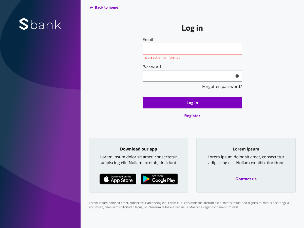
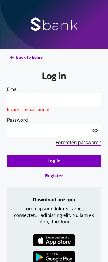
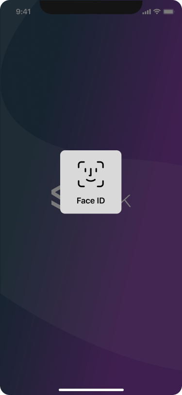
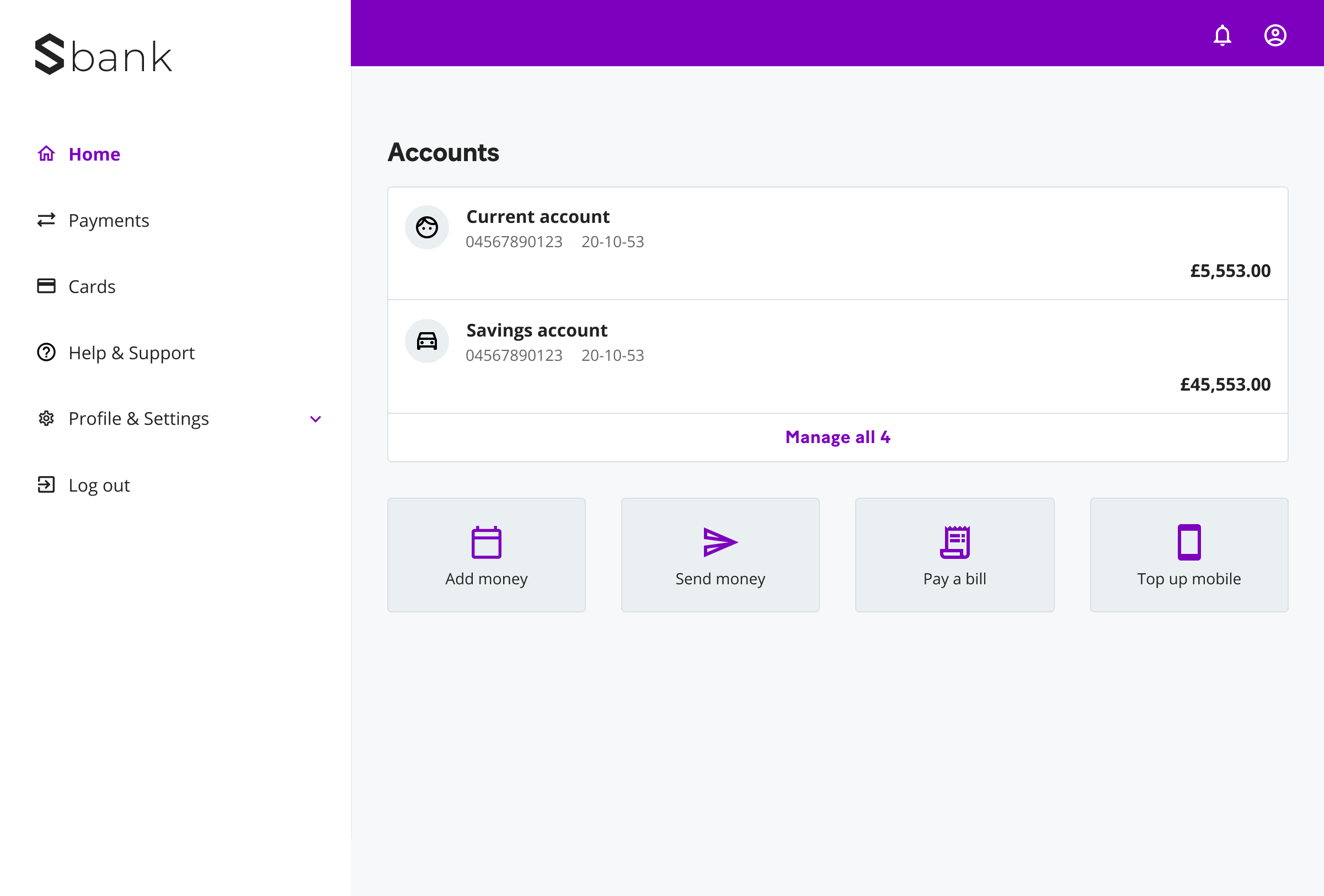
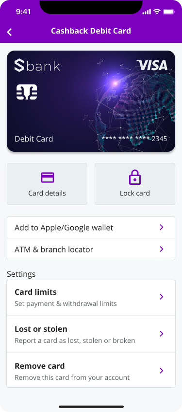
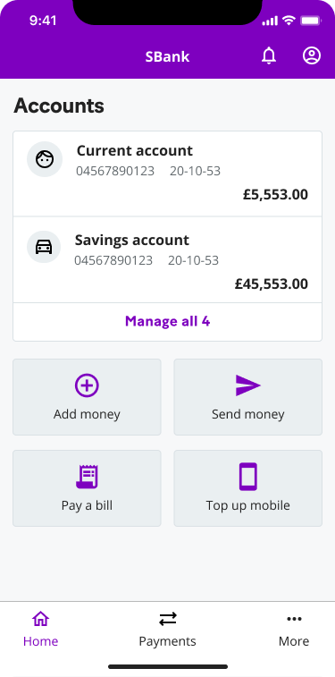
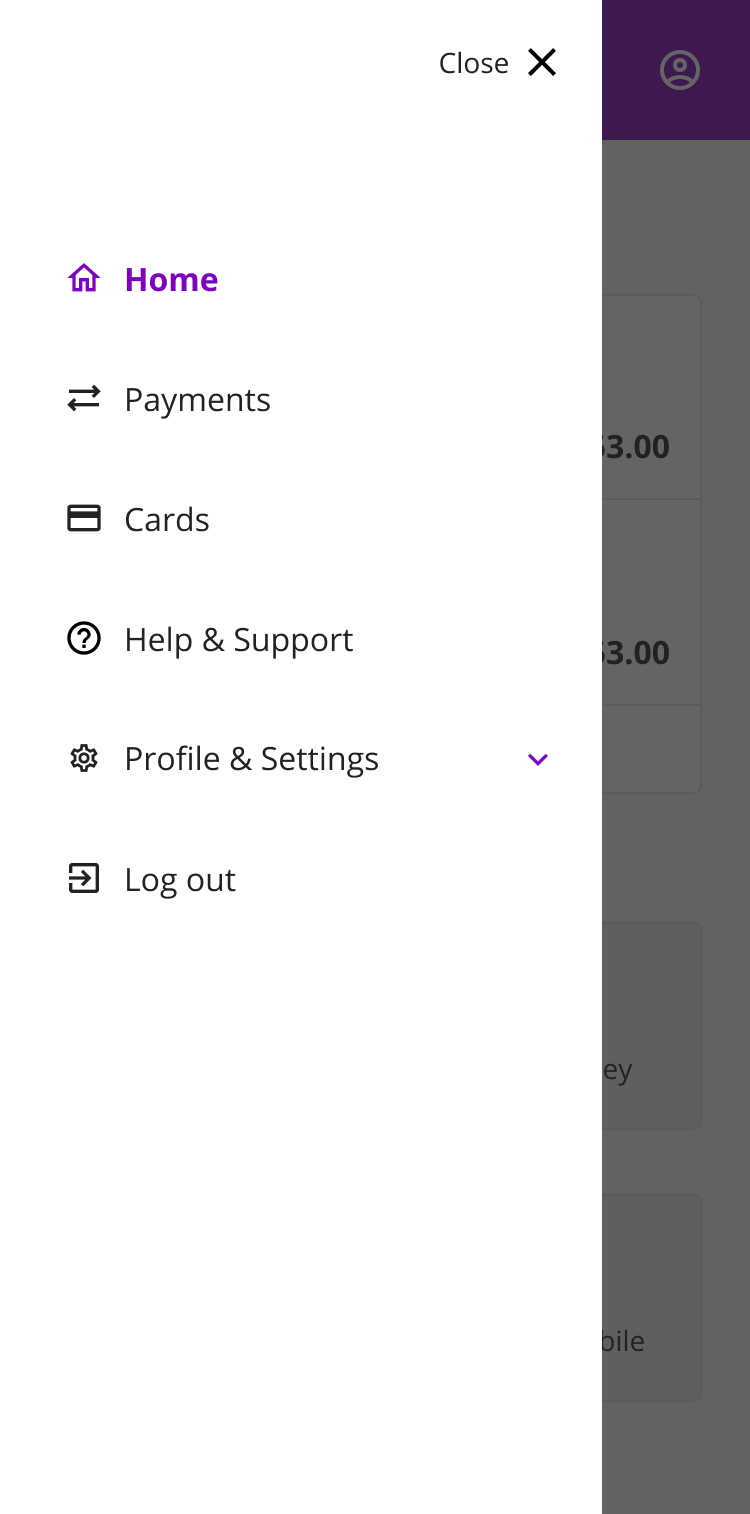
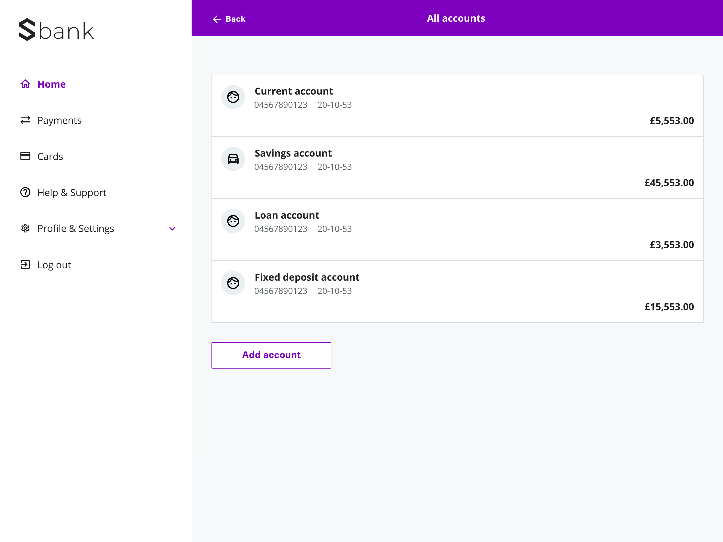
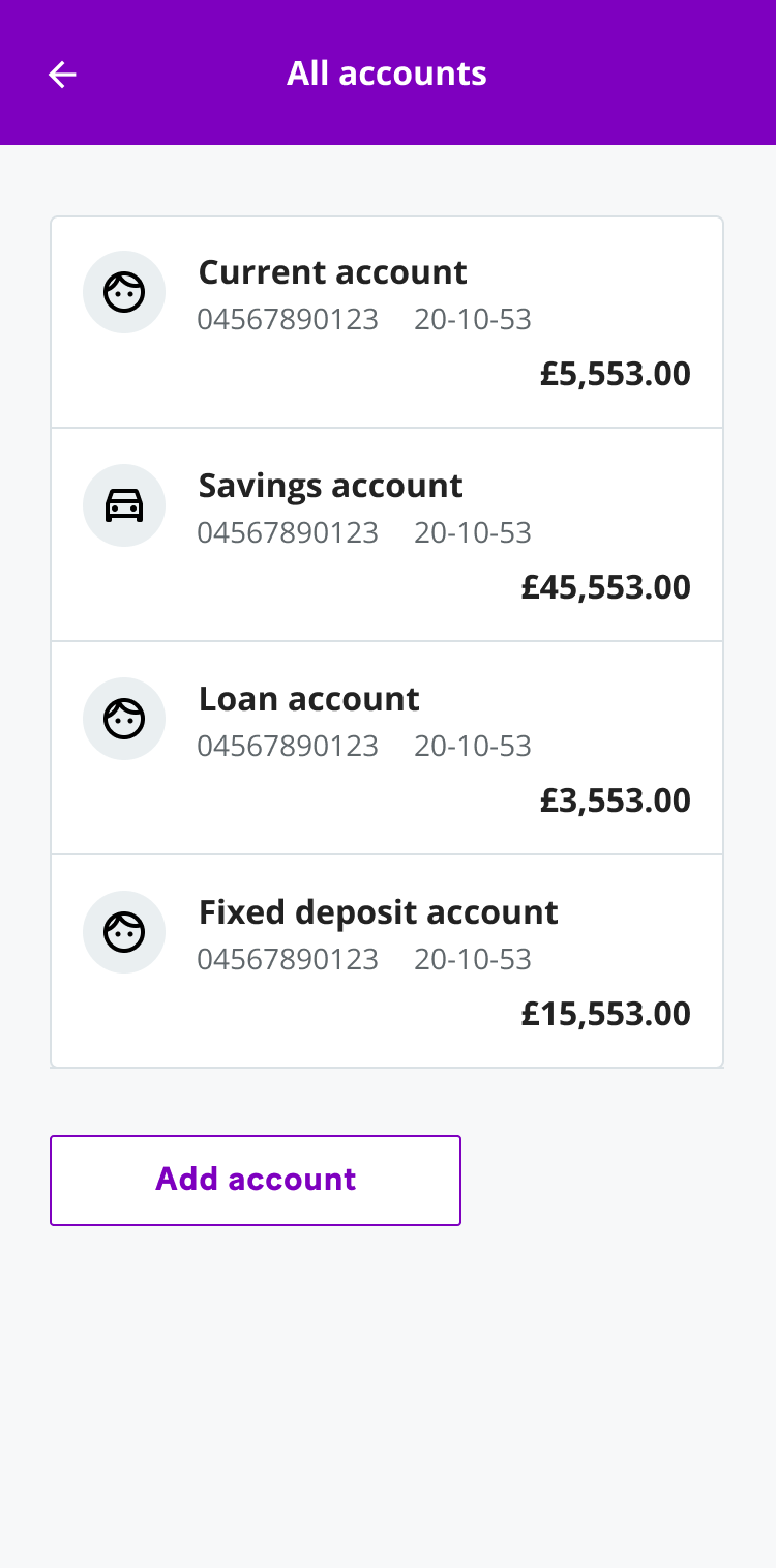
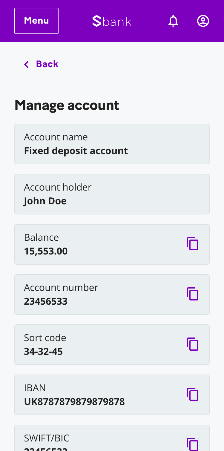
Using it for the first time
Shortly after establishing the design system, Sopra Banking asked us to show them the efficiencies we’d sold them by using it to design a white-label banking app.
Using the design system we were able to quickly work up dozens of high fidelity screen designs in a relatively short design sprint.