

Milk & More
Redesigning Milk & More’s core customer journeys.

Project Duties
UI
UX
We set out to redesign the end-to-end experience. The aim was to create a smooth, flexible experience that builds trust for new users to complete their first order with ease, while allowing returning customers to update, adapt, or build their regular deliveries.
What we did
We ran a series of targeted design sprints informed by in-depth user research.
These sprints focused on three key challenges:
Simplifying the path to purchase
Increasing product awareness to encourage broader basket builds
Enhancing retention for both new and existing customers.
How we did it
We began by exploring different concepts and identifying key user needs through collaborative workshops and stakeholder input. This phase helped us align our thinking around what users expect from a modern grocery delivery service, particularly one rooted in tradition like Milk & More.

Idea generation
Next, we mapped out user journeys for both new and existing customers. This helped us pinpoint critical moments in the experience – such as entry points to the service, product selection, and managing recurring orders – and ensured that the design supported user goals at each step.
We translated our insights into high-fidelity prototypes and tested them with users to validate our assumptions and uncover improvement opportunities.
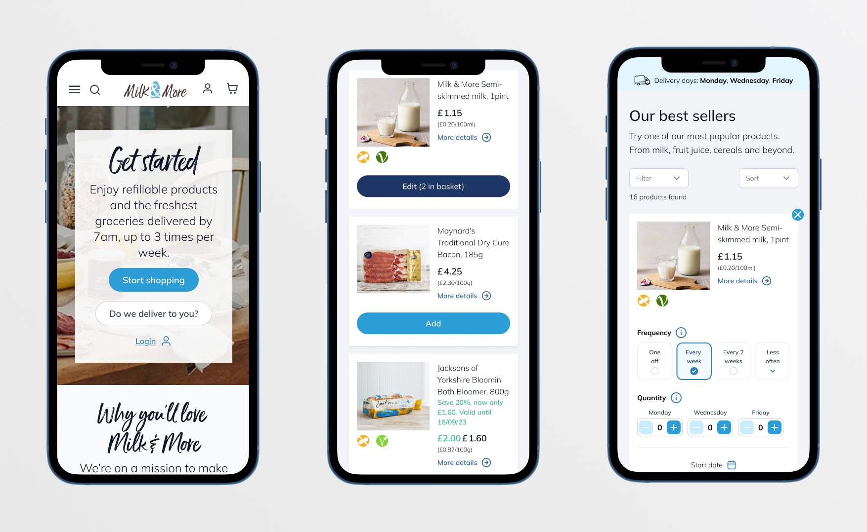
The homepage offers a smooth start for both new and returning users, with options to check availability via postcode or log in directly. First-time users are guided by a clear step-by-step introduction to Milk & More, supported by helpful info icons. As users browse product pages, intuitive selection cards and a visible 3-day delivery banner reinforce trust in the service.
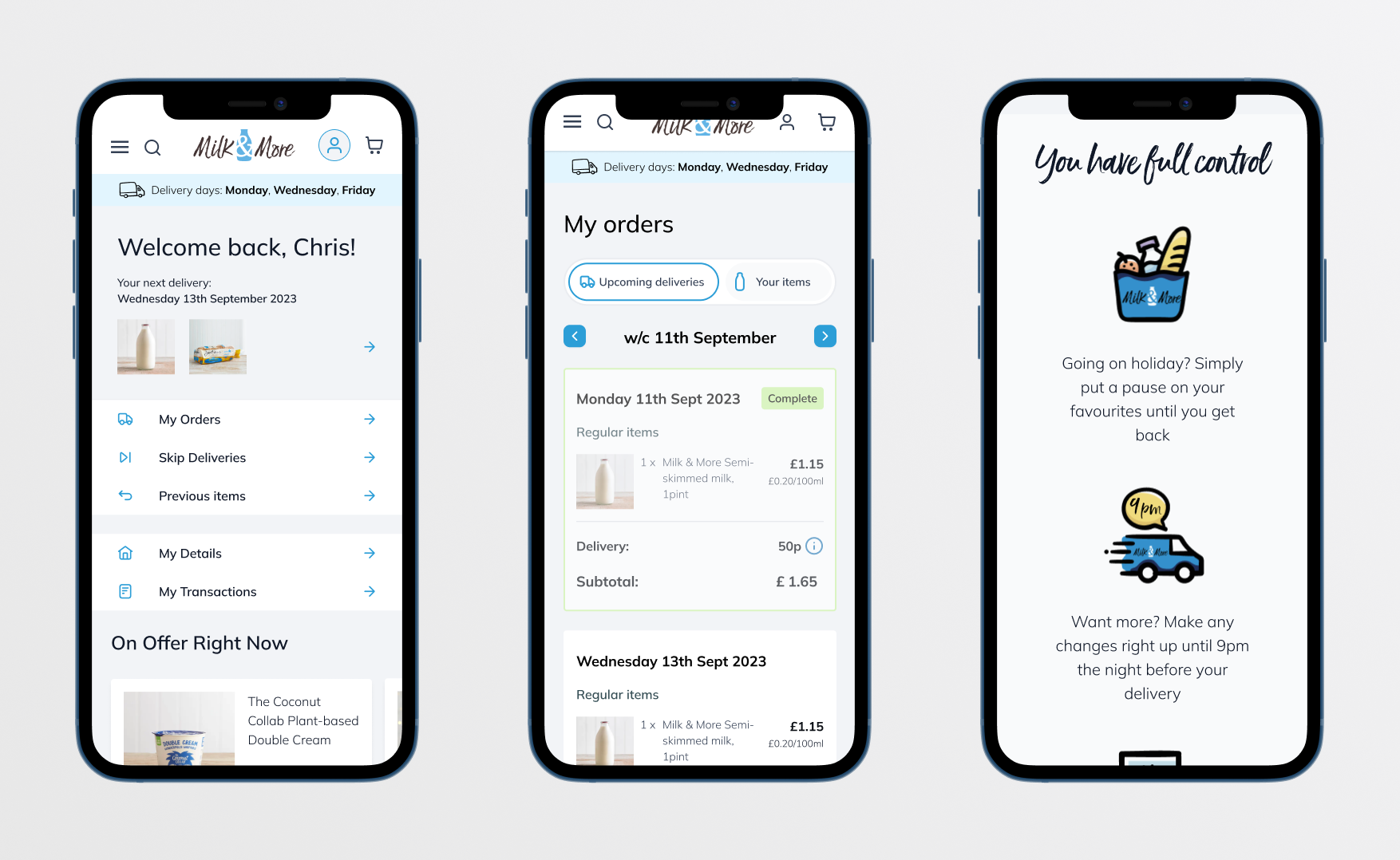
The logged-in experience is streamlined and user-friendly, enabling quick access to key areas like subscriptions and orders. A clear overview of upcoming deliveries and organised item categories make managing orders simple. Users can easily reorder, edit, skip, or remove items.