

SSE
Laying the foundations for a scalable, flexible design system for this energy provider.
Project Duties
UI
UX
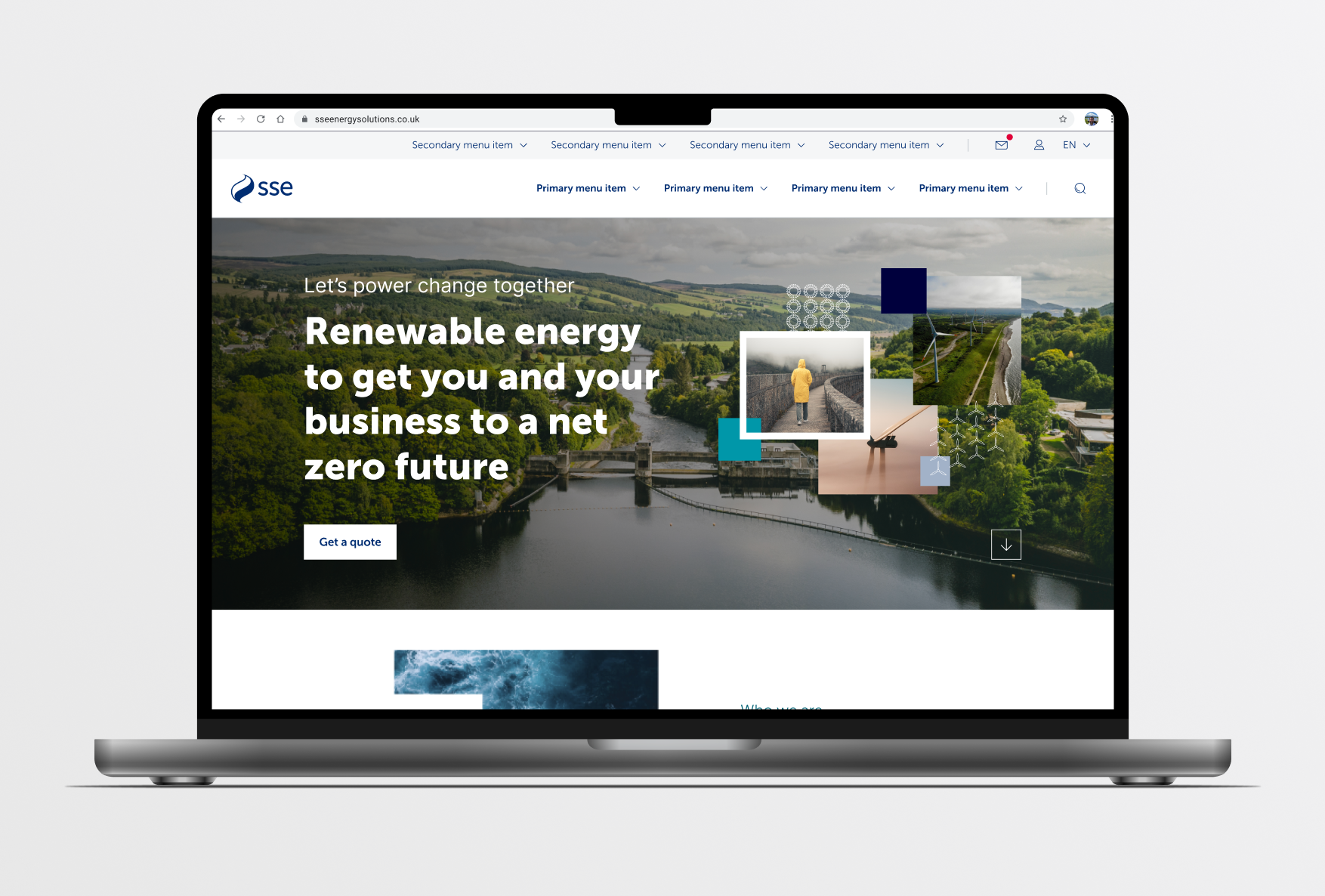
The SSE project aimed to create a shared component library to support a broad spectrum of SSE products – from customer-facing websites to internal tools. The challenge wasn’t starting from scratch, but designing something cohesive and reusable within a fragmented and inconsistent ecosystem.
Making the case for change
We began with a component audit across multiple products. It quickly became clear that visual and structural inconsistencies were widespread – even within individual products. Getting stakeholders to see and acknowledge these inconsistencies was a vital first step.
To move forward, we ran prioritisation workshops, assessing each identified style and component based on the effort required to fix it and the potential impact of doing so. This process allowed us to assign priorities and effectively establish a project backlog, providing a clear roadmap for addressing the inconsistencies.
Starting with the foundations
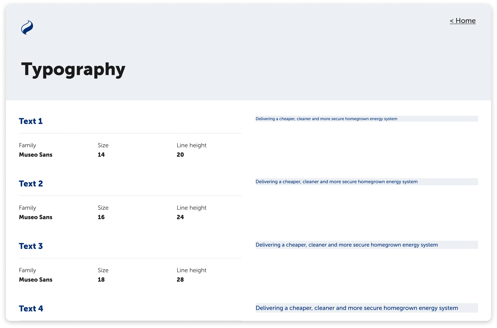
A key consideration was the diverse range of products – spanning front-end and back-end experiences. To allow for this we adopted a less prescriptive approach. Instead of defining fixed type styles like H1, H2 or Body, we created a flexible type scale with guidance on how to apply it.
For example, one fo SSE’s consumer facing sites might use Text 1 or Text 2 for headings, while an internal tool – where information is densely presented – might use Text 4 or Text 5.
The goal was to provide adaptable principles rather than rigid rules, supported by clear examples that teams could reference and apply based on their specific context.


Applying spacing and handling density
Similarly, for spacing, we developed a consistent scale and paired it with guidance on how to apply it effectively – focusing on maintaining clear visual relationships across varying content densities.
To support a wide range of use cases, the Table component was designed in four different sizes, allowing teams to adjust for different levels of information density while maintaining consistency in structure and usability.

Governance
We knew that for the system to live beyond the project, it needed a clear governance model. We defined a process to capture, assess, prioritise, design and publish new component requirements – with future plans to extend this to development as well.
We formed a steering group that included as many product managers and developers as possible. By collaborating closely with them, we were able to align design updates with their development cycles. If a development team was already working on a particular area of a product, it created a natural opportunity to introduce a new, standardised component.
One of the final challenges we looked at was the fragmented technology landscape. SSE websites were built on a variety of platforms with a variety of different frameworks – including Angular, React and Vue. We recommended that developers start by building components in vanilla HTML and JavaScript, with no framework dependencies. Product teams could then adapt these base components into their own tech stacks as needed.
Over time, the plan is to establish a set of components in each of the required coding frameworks.
The outcome
A component library designed not just to tidy up the UI, but to embed flexibility, collaboration, and long-term scalability across SSE.